
"The carving looks nothing like the picture." It is the message we receive more than any other, and it always arrives with a photograph of a panel that is, in fact, carved perfectly well. The file is fine. Something between the file and the eye has flattened it, and there are only seven things that can.
This is the checklist, in the order to work through it. The order matters because the first causes are the most common and the cheapest to fix, and the last one, a genuinely flat file, is rare and cannot be fixed at all. Most people never get past number two.
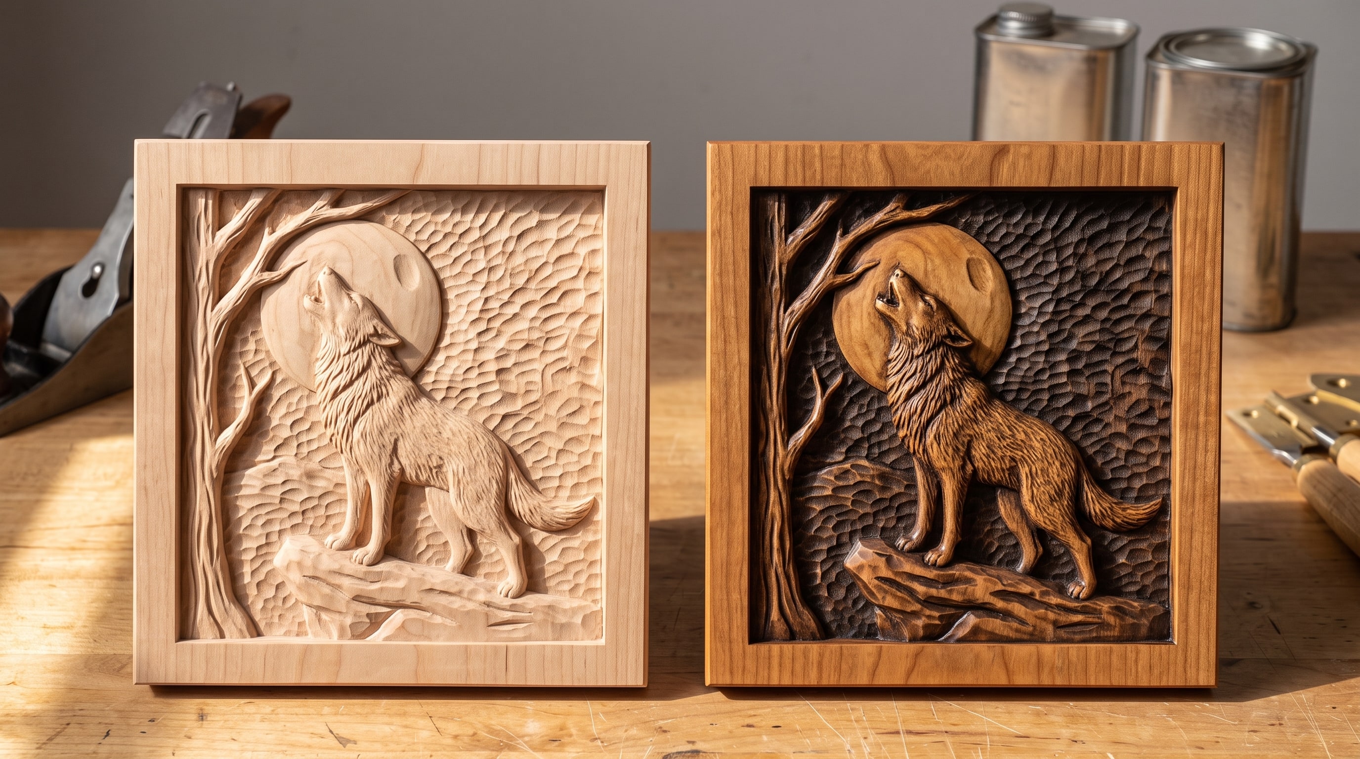
The seven causes, in order
- 1. It is not finished yet
- 2. It is lit from the wrong direction
- 3. The depth was crushed to fit the board
- 4. The bit was bigger than the detail
- 5. The stepover was too coarse, or the machine deflected
- 6. The wood fought the cutter
- 7. The file was flat to begin with
- Why this order
- Questions people ask
1. It is not finished yet
Raw wood is one colour. The only thing that lets you see a raw carving at all is the shadow each edge happens to throw, and under the flat overhead light in most workshops that is almost nothing. A carving that looks lifeless straight off the machine is normal, and it is the state in which most people photograph it and decide the file is bad.
How to tell: the panel is pale and uniform, and it looks better in the morning by the window than it does at night under the shop light.
The fix: brush the fuzz off, seal, flood it with a dark glaze and wipe the glaze back off the high points, then oil. That single glaze step puts colour where the shadows already are and makes the depth read from across the room under any light. It is the whole first half of the finishing guide, and it fixes more "flat" carvings than every other cause on this page combined.
2. It is lit from the wrong direction
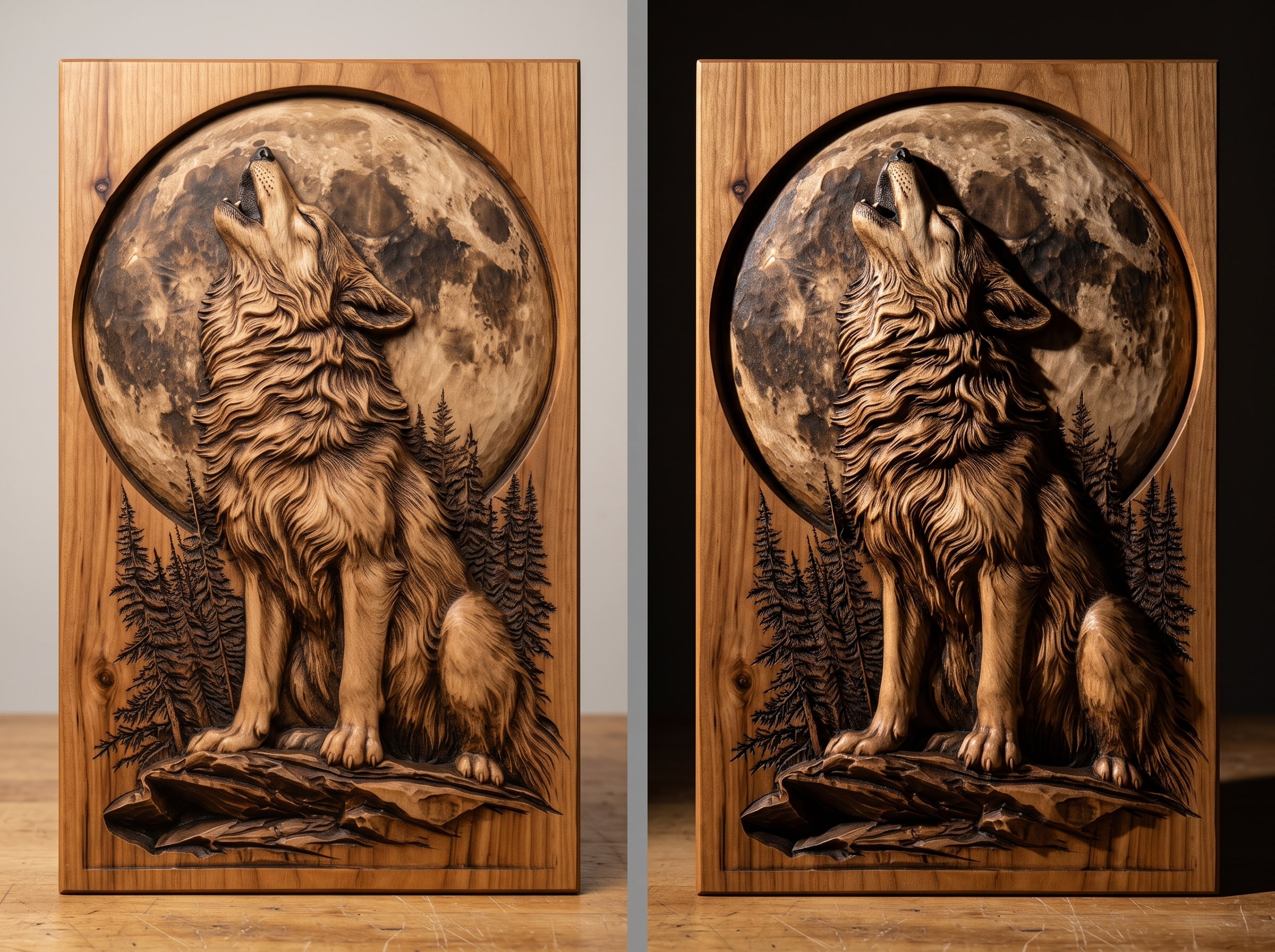
Relief is made of shadow. Light a carving from directly in front and every edge is lit equally, the shadows vanish, and a 14 mm relief looks like a print. Light it from the side, at a low angle, and the same panel becomes sculpture. Product photographs, ours included, are lit from the side for exactly this reason, and the wall above a sofa under a ceiling light is the worst place in the house for a relief.
How to tell: carry it to a window and turn it. If it comes alive as the light rakes across it, the carving is fine and the wall is wrong.
The fix: hang it where light arrives from the side, near a window or a lamp, or add a small picture light above it angled down. If it must go under a ceiling light, a darker glaze in the recesses partly makes up for the missing shadow.
3. The depth was crushed to fit the board
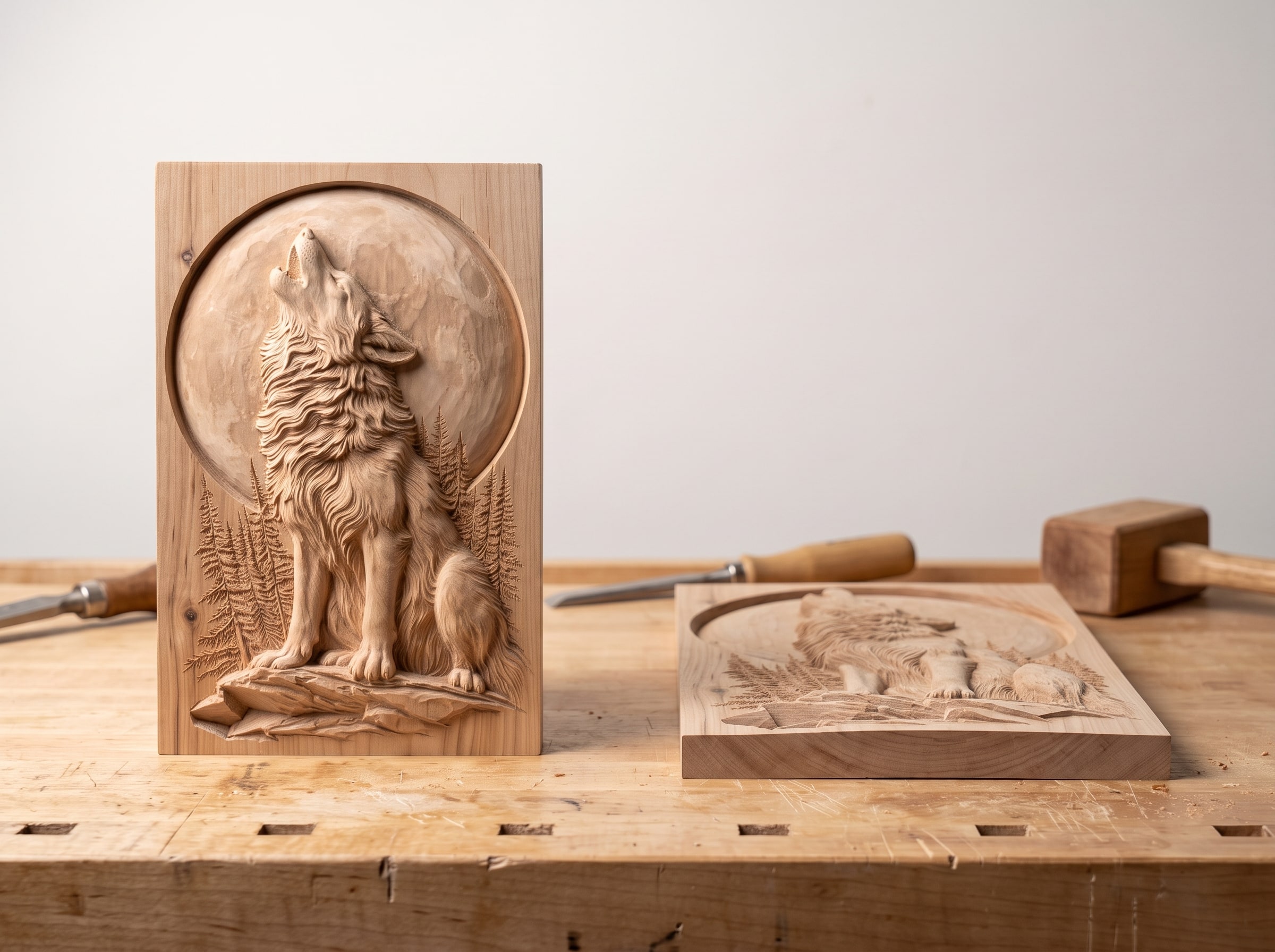
The board was 19 mm, the relief wanted 14, so the model height was typed down to 8 to leave a floor, and the layers collapsed into each other. This is the most common cause that is actually the carver's doing rather than the finish or the light, and it happens on import, in the size dialog, in a second.
How to tell: measure the deepest point with a depth gauge and compare it with what the file shipped at; the product page lists it. If the file says 14 mm and the panel says 8, this is it.
The fix: scale Z with X and Y, never independently; if the board is too thin for the result, use a thicker board rather than a thinner relief. The depth rule and the floor rule in the scaling guide are the two numbers to get right.
4. The bit was bigger than the detail
A cutter cannot render a feature narrower than about two and a half times its tip. Carve a 300 mm face with a 1/8 inch ball nose and the eyelids, which are 2 mm wide at that size, simply do not exist in the wood. Everything larger is there; everything that gives the face its expression is gone; the result reads as flat even though the depth is correct.
How to tell: the big shapes are crisp and the small ones are soft or missing. Compare against the CAM's toolpath simulation, which knows the bit size, rather than the model render, which does not.
The fix: a 1/16 inch tapered ball nose for most panels and a 1/32 inch inside a boundary around faces and text. The bits guide has the table.
5. The stepover was too coarse, or the machine deflected
Every raster line leaves a scallop beside it, and a 20% stepover leaves scallops big enough to read as texture from a metre away. The eye reads that texture as blur, and blur as shallowness. Deflection produces the same look unevenly: a belt-driven machine pushed too fast leaves ridges that vary across the panel.
How to tell: run a fingertip across a smooth area. Corduroy means stepover; ridges that come and go mean deflection.
The fix: 12 to 15% on the semi-finish, 8 to 10% inside a boundary on the detail, and a slower feed on a flexible machine. It costs time, which is why the carve-time guide exists.
6. The wood fought the cutter
Pine tears out at every fine edge. Oak's pores are as big as the detail and its grain pattern runs straight through a face. Basswood crushes rather than cuts under a small bit and fuzzes over the fine lines. All three give a carving that looks softer and flatter than the same file in cherry, before anyone has done anything wrong.
How to tell: the fuzz is worst where the cutter crossed the grain, and the grain pattern is as visible as the design.
The fix: a brass brush and a sharp cutter help; the real fix is the next board. The wood guide shows the same design in eight species so you can see exactly what each one does to it.
7. The file was flat to begin with
Last, and rarest with a file from a studio that checks its work: the model itself has no depth grading. Sky, trees and subject all live in the same 3 mm, and no finish, light, bit or wood can put back layers that were never modelled.
How to tell: open the file in any viewer and look along the surface, edge-on. A good relief has countable levels; a flat one is a smooth bump. Do this before you carve, not after.
The fix: there is none, beyond a different file. The profile test in our file-quality guide takes thirty seconds and would have caught it.
Why this order
Because the first two causes explain most flat carvings and cost nothing to fix, and the last one cannot be fixed at all. Work down the list and stop when you find it. In our experience of the photographs people send:
- about half are unfinished or badly lit,
- a quarter had the depth crushed on import,
- most of the rest are the bit or the stepover,
- a few are the wood,
- and almost none are the file.
If you want a panel to practise the whole list on, the Howling Wolf and Full Moon Bas-Relief STL for CNC Carving in the photographs has a pale moon that shows lighting and finish immediately, fur that shows stepover, and a clear subject-and-background split for the depth check.
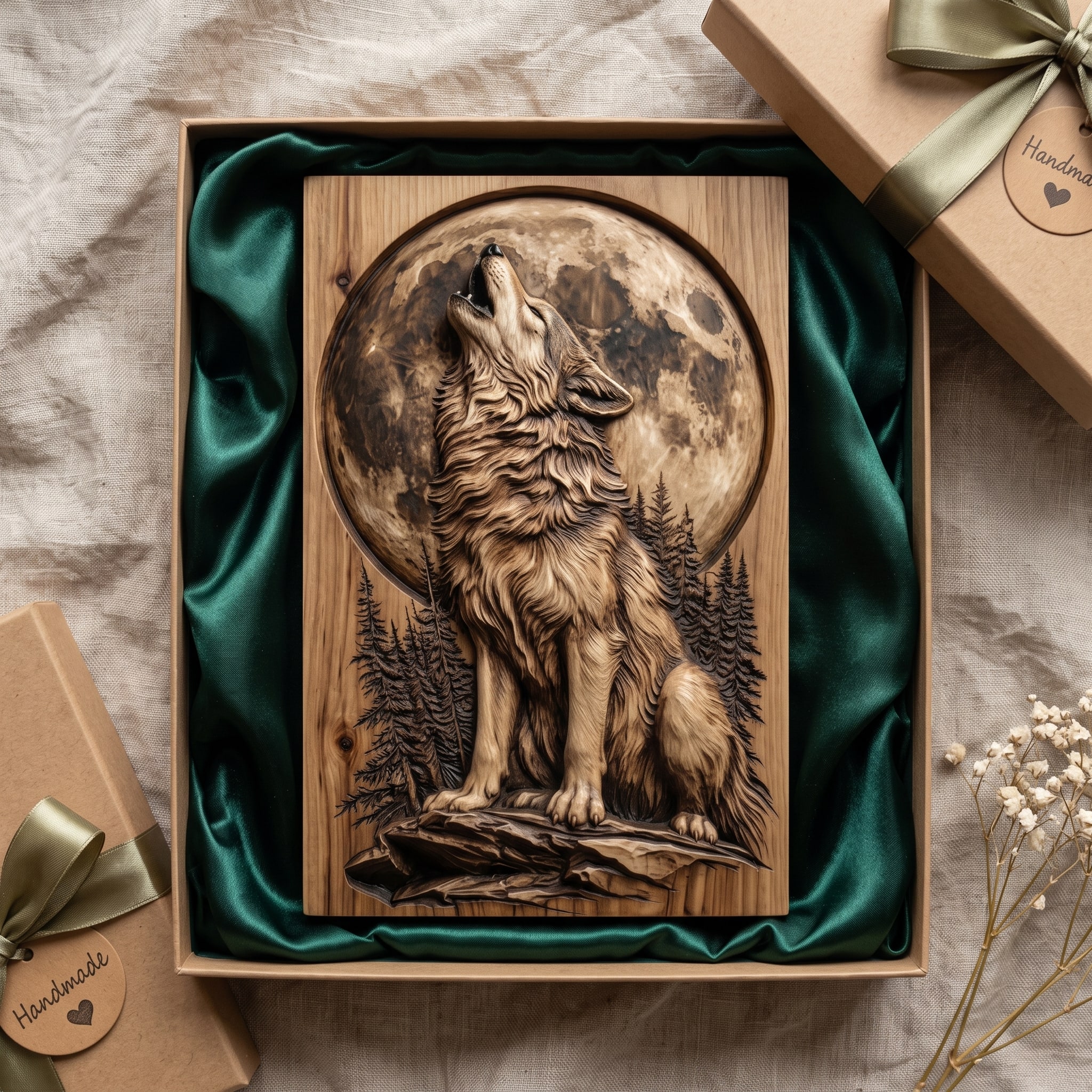
Download the howling wolf panel · $7.19
Questions people ask
Why does my CNC carving look flat?
Most often because it is unfinished and lit from the front. Seal, glaze the recesses dark, oil, and light it from the side. If it is still flat, check the depth was not reduced on import.
Why does my carving look blurry?
The finishing bit was larger than the fine detail, or the stepover was too coarse. Use a 1/16 or 1/32 inch tapered ball nose at 8 to 10% inside a boundary around the detail.
Is the file bad?
Rarely. Check it edge-on in a viewer: countable depth levels mean the file is fine and the cause is on this list; a smooth bump means the file is flat.
Does staining make a carving look deeper?
A glaze wiped back off the high points does, dramatically, because it puts dark colour in the recesses where the shadows belong. A uniform stain does not.
Where should I hang a relief carving?
Where light arrives from the side: near a window, under a picture light, or beside a lamp. Directly under a ceiling light is the worst place for it.
Seven causes, in order, and the fix for almost all of them is an hour with a tin of glaze and a different wall. The file is the last thing to suspect, and the profile test tells you in thirty seconds whether to suspect it at all.
Jolly, DigitalChiselCo