A reader wrote in this week with a question we get in some form every month: "A lot of your designs on the site seem enhanced by colouring or shading. Do you have any tips on how this may be done on the designs I cut?"
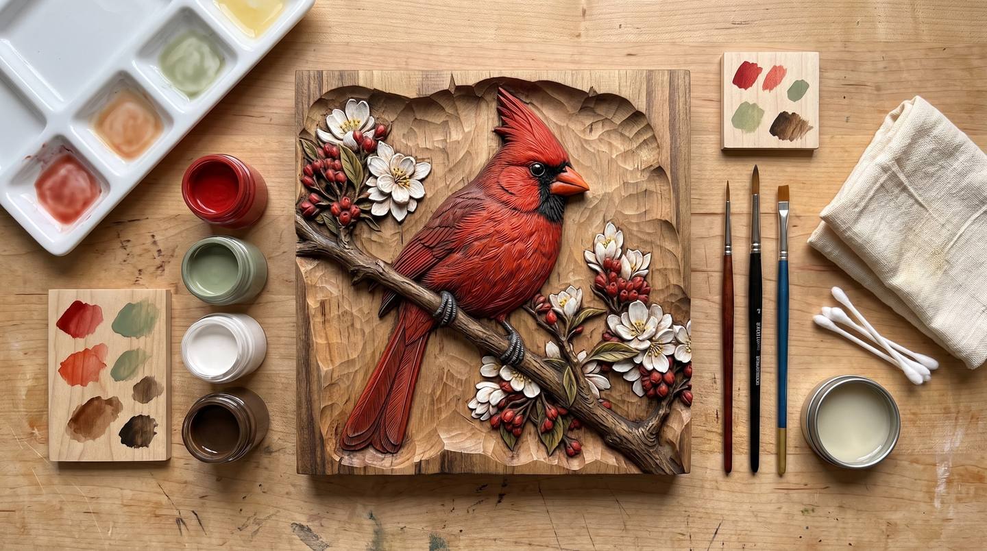
The short answer is that it is not paint, and it is not stain, and the difference matters. Paint sits on top of wood and hides it. Stain soaks into wood and cannot be controlled at a carved edge. The look on those product photos, a red bird that still shows grain, blossoms that are white but not chalky, a background that is plainly still wood, comes from a third thing: thin translucent washes over sealed wood, finished with the same dark glaze that makes any relief carving read.
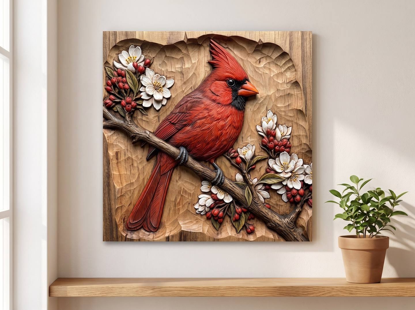
This guide is the whole method, worked stage by stage on one panel, the Northern Cardinal on a blossom branch, so you can see exactly what each step changes. It assumes the carving is already off the machine and cleaned up; the fuzz, sanding and sealing basics are in the finishing guide, and this article picks up where that one says "paint, metallics and two-tone finishes" and stops.
What this guide covers
- The three looks, and which one this is
- Why washes work and paint does not
- Choosing a design and a board that suit colour
- What to buy: media, brushes, and the kit
- Step 1: Seal first, always
- Step 2: The test tile
- Step 3: Mixing washes that look natural
- Ten colour recipes for carved subjects
- Step 4: The first wash, lightest and thinnest
- Step 5: Building the other colours
- Step 6: Shading, so the form comes forward
- Step 7: The small touches
- Step 8: Keeping the ground clean
- Step 9: The glaze that ties it together
- Step 10: A matte topcoat, never gloss
- Optional: a trace of metal
- Other routes: dyes, coloured gel stains, milk paint, and printed reliefs
- Troubleshooting
- Designs that were made for colour
- Common questions
The three looks, and which one this is
Put the same carving through three different finishing schedules and you get three different objects.
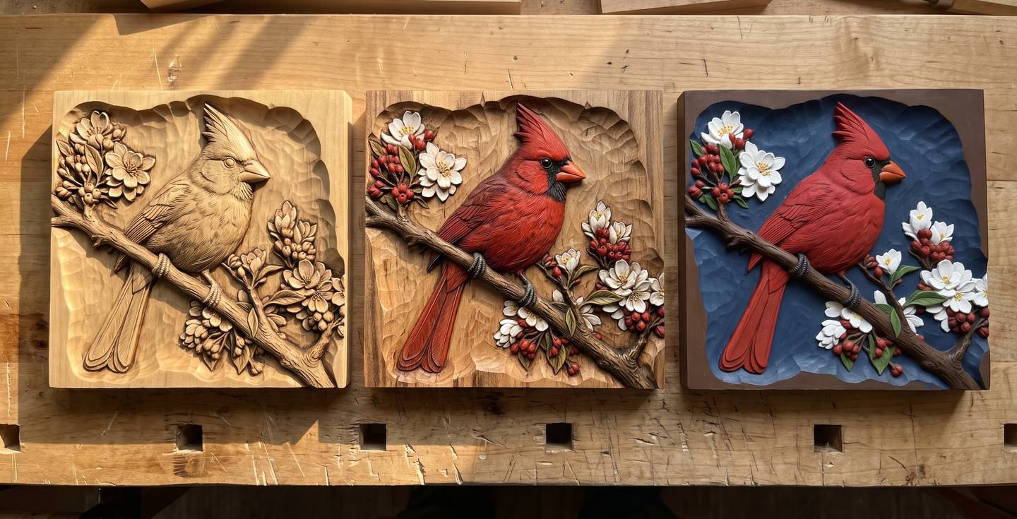
- Natural and glazed. No colour at all. The recesses are antiqued dark, the high points are clean wood, and the carving reads by contrast alone. This is the house finish on most of our product photos and it is covered in full in the finishing guide.
- Tinted. The subject carries thin, see-through colour that lets the grain show, and the background stays natural wood. It reads as a wooden object that happens to be coloured, rather than a painted one. This is what the reader was asking about, and it is what the rest of this article teaches.
- Opaque. Solid paint, often with a painted ground as well. Right for signs, folk art, nursery pieces and outdoor work, wrong when you want people to see the wood. Covered briefly near the end.
The tinted look is the hardest of the three to describe and the easiest to do, because every step is forgiving. Thin colour can always be built up. Thick colour cannot be taken back.
Why washes work and paint does not
A relief carving reads through two things: light falling across its surface, and the wood's own figure running through every form. Opaque paint kills both. It fills the fine tooling texture that catches light, and it puts an even skin over the grain, so a carved bird becomes a moulded one.
A wash is pigment diluted so far that it becomes a tint rather than a coat. It settles into the tooling marks a little more than it sits on the ridges, so the texture is emphasised rather than buried. It is transparent, so the grain shows through the red exactly as it shows through the natural wood beside it. And because it is thin, it has almost no edge: you can carry it right up to a carved outline and stop, and the eye reads a clean boundary between coloured feather and bare wood.
The other half of the method is the glaze at the end. Fresh acrylic washes, however carefully mixed, look slightly too clean, too new. A brown glaze flooded over everything and wiped back does three jobs at once: it darkens the recesses so the depth reads, it knocks a few percent off the brightness of every colour so they agree with the wood, and it leaves a hint of brown in the texture of the coloured areas so they look like tinted wood rather than paint on wood. Skip it and the piece looks like a craft project. Do it and it looks like it was always that colour.
Choosing a design and a board that suit colour
Not every relief wants colour. The ones that take it best have a clearly bounded subject with a natural palette, sitting on a plain carved ground: a bird on a branch, a rose, a fish, a bouquet, a heart of flowers. Deep scenic panels with a landscape running to the edge are better left natural, because there is no bare wood left to contrast with, and portraits of people are nearly always better natural too; skin tones in wash are a specialist's job and a face that is slightly off in colour is worse than one that is plainly wood.
The board matters more than for a natural finish, because the colour has nowhere to hide:
| Species | For tinted work | Why |
|---|---|---|
| Basswood | Best | Pale, even, almost no figure to fight the colour. Blotches if unsealed, so seal it. |
| Hard maple | Excellent | Crispest detail and a clean pale ground. Must be sealed or the wash goes patchy. |
| Birch and alder | Very good | Pale and predictable, cheaper than maple. |
| Poplar | Good if sealed well | The green streaks vanish under a wash and glaze; a fine budget choice for coloured work. |
| Cherry | Fair | Its own warm colour pushes every wash toward orange, and it darkens for a year. Lovely natural, awkward tinted. |
| Walnut, sapele | Avoid for colour | Too dark; a wash disappears, and only opaque paint shows. |
| Red oak | Avoid | Open pores drink wash unevenly and the coarse grain competes with the detail. |
The cardinal in this series is on basswood, which is what most of the coloured carvings you see online are on, for exactly these reasons.
What to buy: media, brushes, and the kit
The colour itself
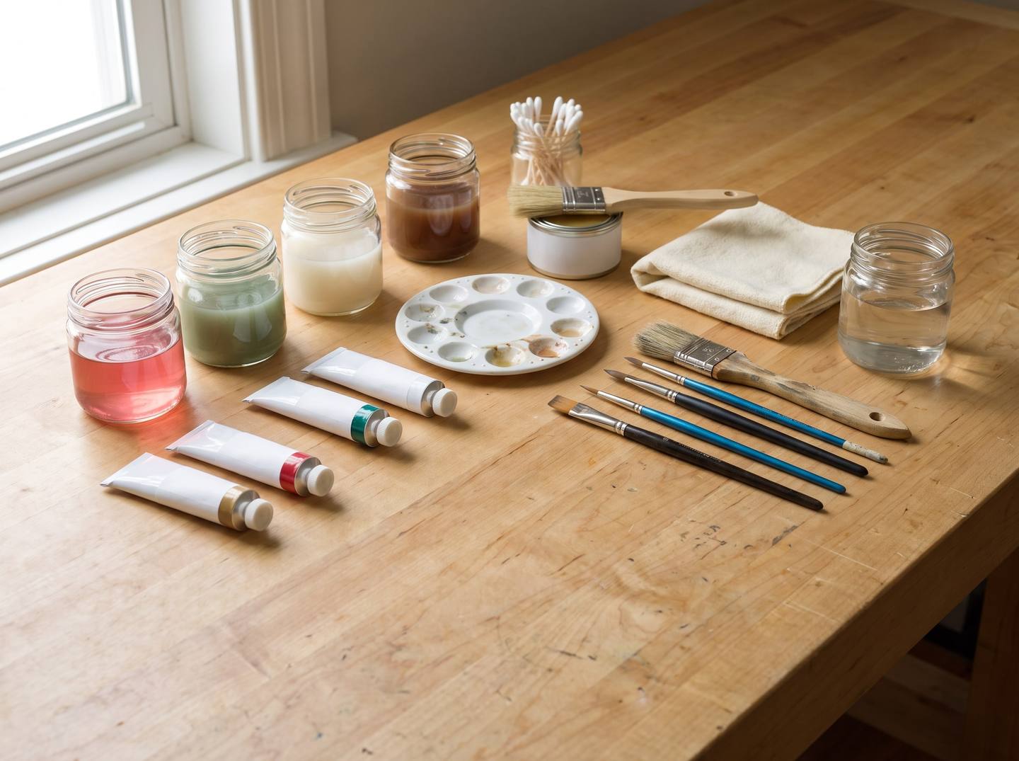
Artists' acrylics, thinned with water, are the right default. They are cheap, they mix to any colour, they dry in minutes, they clean up with water, and diluted properly they behave exactly like a wash should. Three grades, in order of how much they will please you:
- Fluid or soft-body artists' acrylics. Golden Fluid Acrylics and Liquitex Soft Body are the two to look for. High pigment load, so they stay strong when heavily diluted, and no fillers to go chalky. Six tubes cover everything in this guide.
- Heavy-body artists' acrylics such as Liquitex Basics, Winsor & Newton Galeria or Golden Heavy Body work just as well but need more water and a minute more stirring.
- Craft acrylics such as DecoArt Americana, FolkArt and Apple Barrel. Cheap and everywhere, and fine for a first attempt. They carry more filler, so they go slightly milky when thinned far; add a little less water and expect a second coat.
Two helpers make washes behave: a flow improver (Golden Wetting Aid, Liquitex Flow Aid, a drop or two per jar) stops a thin wash beading on sealed wood, and distilled water if your tap water is hard, which can flocculate a thin mix.
What about the alternatives you will see recommended?
- Artists' oil colour thinned with mineral spirits is the traditional carver's medium and gives the softest, most blended result. Winsor & Newton Winton or Gamblin 1980 are affordable. The cost is drying time, days rather than minutes, and it is harder to keep off the ground. Good for a second panel, not a first.
- Water-based wood dyes (TransTint, Keda, General Finishes Dye Stain) colour the wood itself and show the grain perfectly, but they soak along the grain past any carved edge and cannot be wiped back. Right for colouring a whole area such as a sky; wrong for a red bird on bare wood. See other routes.
- Coloured gel stains and glazes (Unicorn SPiT is the one CNC forums love, General Finishes Glaze Effects in colours) sit somewhere between the two. Usable, and forgiving, but they are thicker than a true wash and give a slightly heavier look.
- Watercolour lifts when the topcoat goes on. Do not.
Brushes
Synthetic, not natural bristle. Water and thin acrylic are what synthetics were designed for, and a good synthetic round comes to a point that a sable will not hold in wash. Princeton Velvetouch, Royal & Langnickel Zen and Winsor & Newton Cotman synthetic are all fine and none costs much. You need:
- Three rounds: a size 2 for eyes, blossom centres and edges, a size 6 for feathers and leaves, a size 10 for the big areas.
- One narrow flat, about 12 mm, for branches and stems.
- One old, stubby flat or a cheap hog bristle for dry brushing highlights later.
The rest of the kit
- A white ceramic palette or a white plate. You must be able to judge the strength of a wash against white.
- Small glass jars with lids to keep mixed washes; a mixed wash lasts a week sealed.
- Cotton buds, a lot of them, and a lint-free rag (old cotton T-shirt, not paper towel, which sheds).
- A sealer: dewaxed shellac (Zinsser Bulls Eye SealCoat) thinned one to one with denatured alcohol, or a water-based sanding sealer such as Minwax or General Finishes.
- A dark glaze: General Finishes Glaze Effects in Van Dyke Brown, or a gel stain such as General Finishes Java or Antique Walnut, or Minwax Gel Stain in Walnut.
- A matte or satin clear topcoat: General Finishes High Performance in Flat or Satin, Minwax Polycrylic Matte, or an aerosol lacquer such as Deft or Watco Satin.
- Optional: Rub 'n Buff in Antique Gold, for the last touch.
Total, if you own none of it, is around the price of one good router bit.
Step 1: Seal first, always
If you take one rule from this guide, take this one. Colour goes on sealed wood, never bare wood.
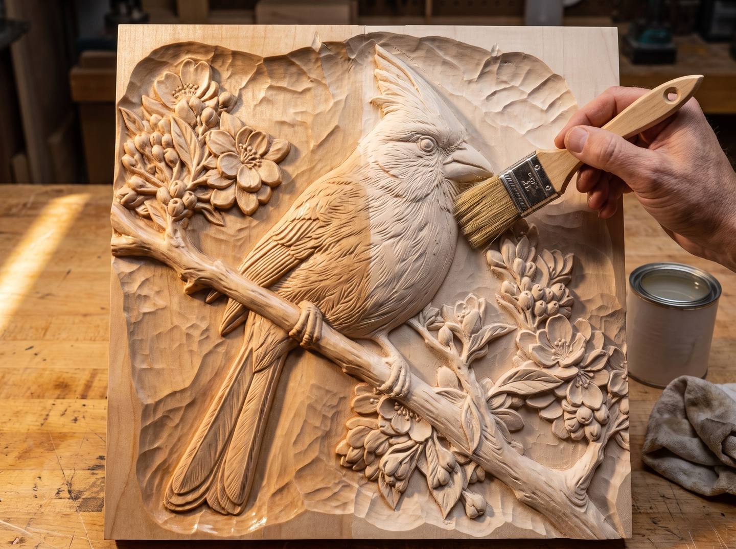
Bare wood drinks a thin wash the way blotting paper drinks ink. The colour runs along the grain past the edge you were aiming for, soaks deeper into soft early growth than into dense late growth so the tint goes stripy, and once in, it cannot be lifted. Sealed wood does the opposite: the wash sits on the surface, spreads only as far as the brush takes it, and can be wiped back with a damp bud within a minute of going on. Every later step in this guide depends on that.
Prepare the carving as the finishing guide describes, fuzz off with a brass brush, high points sanded to 320 and no further, dust blown out of the recesses. Then:
- Brush on one thin coat of dewaxed shellac at roughly a one-pound cut (SealCoat thinned one to one), or a water-based sanding sealer straight from the tin. Work it into every recess; do not let it pool.
- Let it dry, twenty minutes for shellac, an hour for water-based.
- Scuff very lightly with a grey or maroon abrasive pad, just enough to take the shine off the high points so the wash has a little tooth. Blow off the dust.
One coat is right. Two coats make a surface so closed that the wash beads and will not lay flat. If you are using an oil colour rather than acrylic, shellac is still the sealer; anything sticks to dewaxed shellac.
Step 2: The test tile
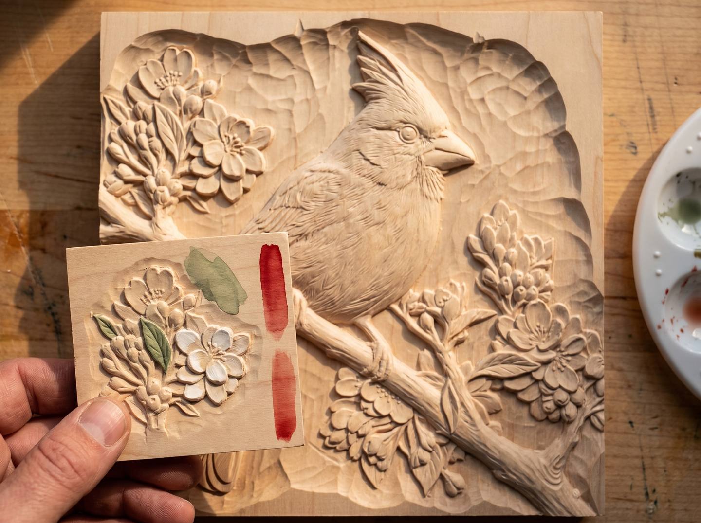
Cut a small tile from the same board, and if your CAM software lets you, carve a crop of the actual design on it: a corner of the blossoms, one leaf, a patch of the bird. Seal it with the panel. Every wash in the next step gets tried on this tile before it touches the carving, because a colour that looks right on a white palette looks different over honey-coloured wood, and different again after the glaze. Ten minutes here has saved more coloured carvings than any other habit.
Keep the tile. When you glaze, glaze the tile first, and you will know what the glaze is going to do to the pink before it does it.
Step 3: Mixing washes that look natural
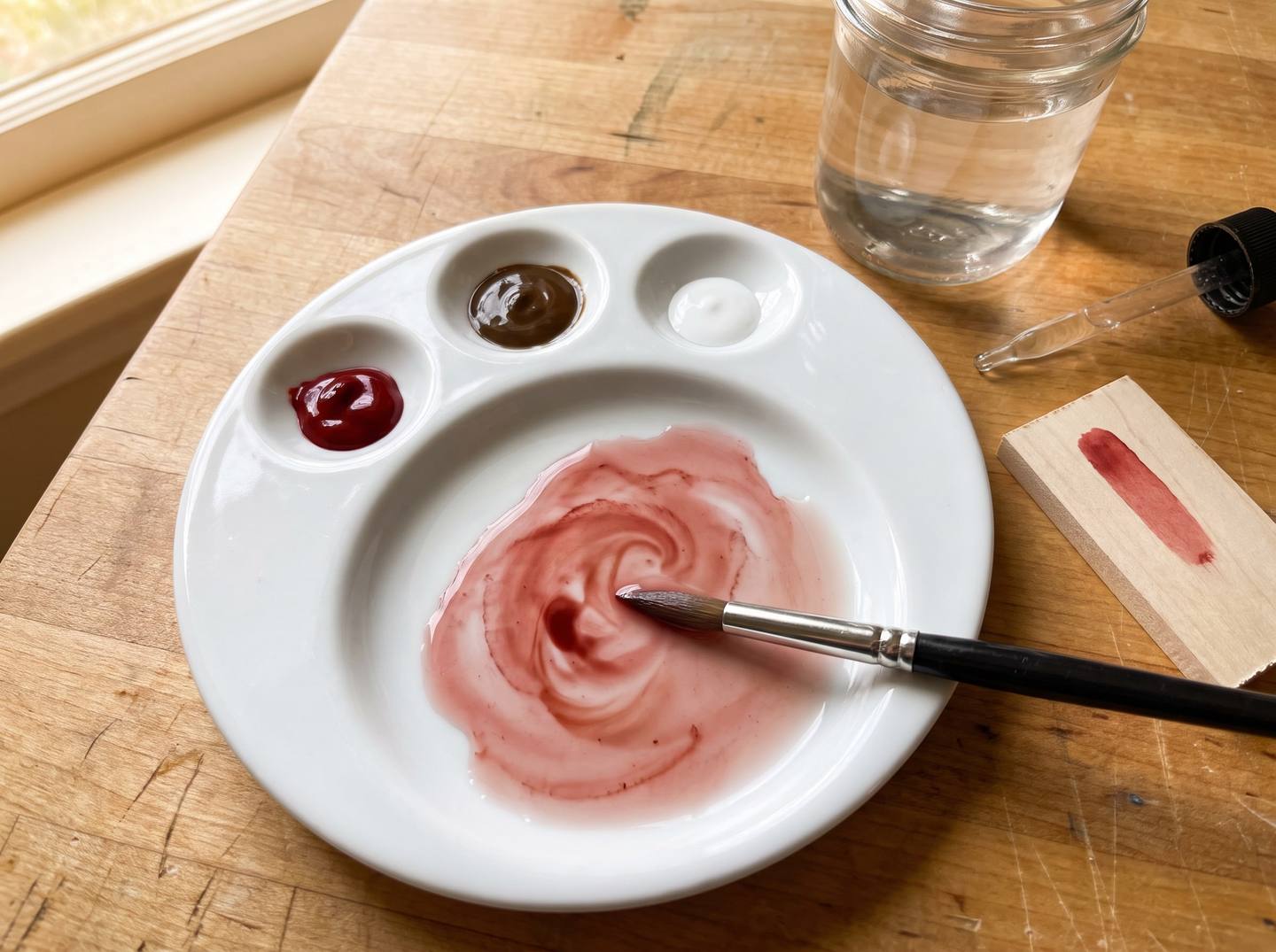
Three rules decide whether the result looks like it grew there or looks like a craft project.
Rule one: never a colour straight from the tube. Tube colours are made to be as pure and bright as pigment allows, and nothing in nature or in wood is that pure. Every wash in this guide gets an earth pigment in it, a brown or an ochre, which is what makes the colour agree with the wood around it. The cardinal is not Cadmium Red; it is Cadmium Red with a little Burnt Sienna pulling it toward the branch it sits on.
Rule two: skimmed milk. That is the consistency. Roughly one part paint to four or five parts water, stirred until there are no streaks, thin enough that the white of the palette reads clearly through a puddle of it. If in doubt, thinner. A wash that is too weak is fixed with a second coat in three minutes; a wash that is too strong has already covered the grain.
Rule three: mix more than you need, and keep it. Matching a wash a day later is nearly impossible, and you will want the same red for the second coat, the shading base, and the touch-ups after the glaze. A small lidded jar per colour, labelled.
The pigments named below are standard artists' names and every brand sells them. For a first coloured carving, six tubes are plenty: Cadmium Red Medium, Burnt Sienna, Raw Umber, Sap Green, Yellow Ochre and Titanium White. Add Cerulean Blue if there is water or sky in the design, and Quinacridone Red or Alizarin Crimson for roses and berries.
Ten colour recipes for carved subjects
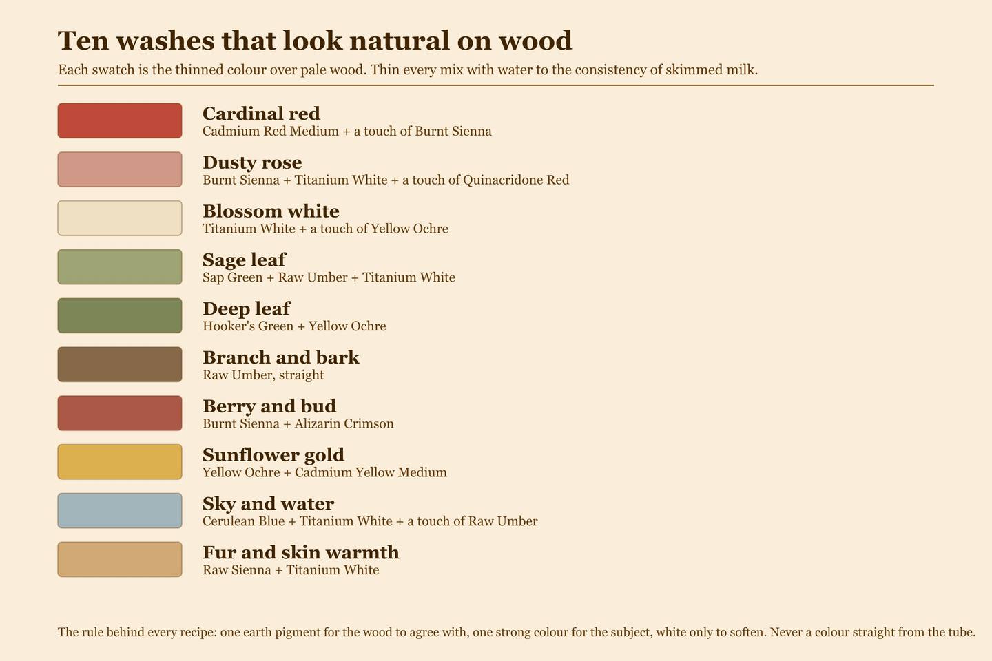
These are starting points, not laws. Adjust on the test tile. The cardinal in this series uses the first, third, fourth, sixth and seventh.
- Cardinal red: Cadmium Red Medium with a touch of Burnt Sienna. Pure cadmium is a fire engine; the sienna makes it a bird.
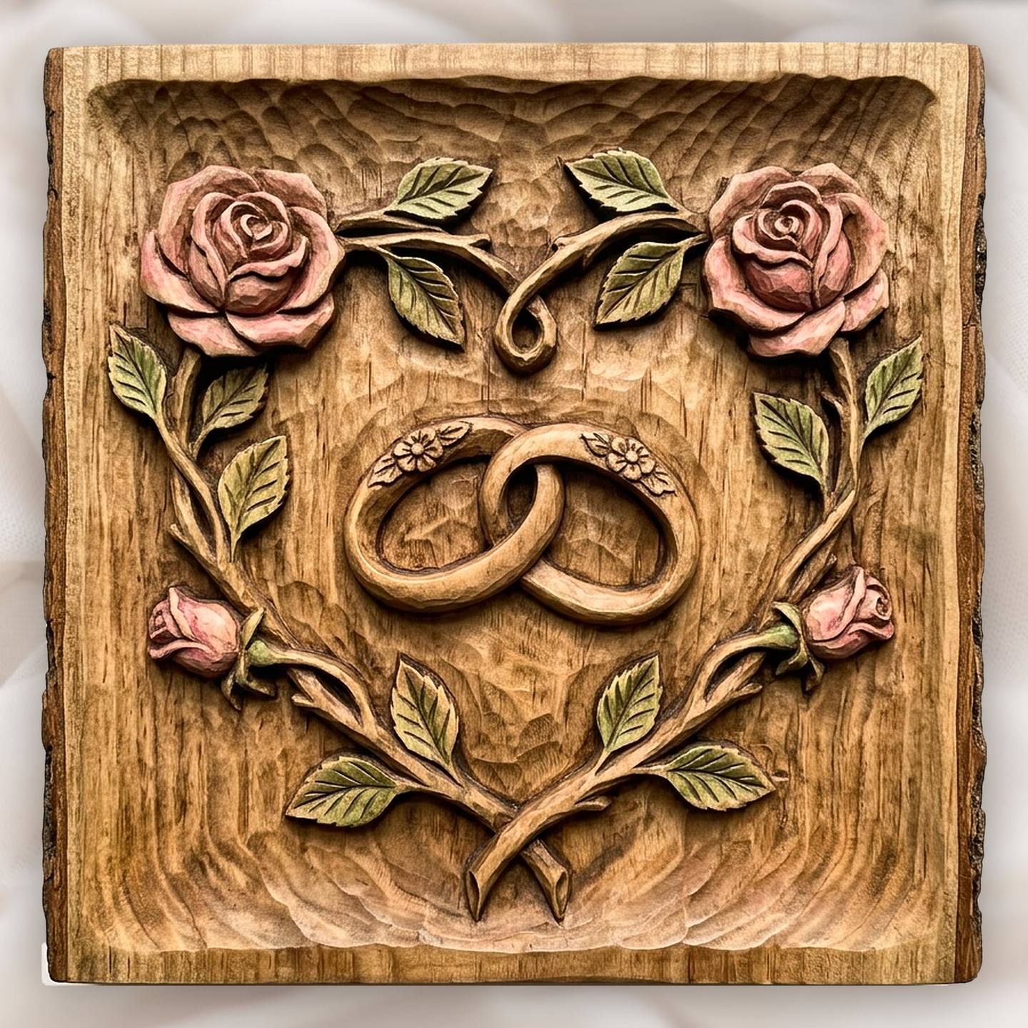
- Dusty rose: Burnt Sienna and Titanium White, warmed with a touch of Quinacridone Red. The colour of the roses on the wedding-rings panel on this site.
- Blossom white: Titanium White with a touch of Yellow Ochre. Pure white on wood looks like correction fluid; the ochre makes it cream that reads as white.
- Sage leaf: Sap Green, Raw Umber and a little Titanium White. The single most useful green; almost every leaf is closer to this than to anything labelled "leaf green".
- Deep leaf: Hooker's Green with Yellow Ochre, for the shadow side of foliage.
- Branch and bark: Raw Umber, straight. The one exception to rule one, because Raw Umber already is an earth.
- Berry and bud: Burnt Sienna with Alizarin Crimson. Brick red, not cherry.
- Sunflower gold: Yellow Ochre with a little Cadmium Yellow Medium. The ochre does the work; the cadmium lifts it.
- Sky and water: Cerulean Blue, Titanium White, and a touch of Raw Umber to stop it looking like a swimming pool.
- Fur and skin warmth: Raw Sienna with Titanium White, thinner than everything else. On animal fur and on the few faces that want any colour at all, this is as far as a wash should go.
Step 4: The first wash, lightest and thinnest
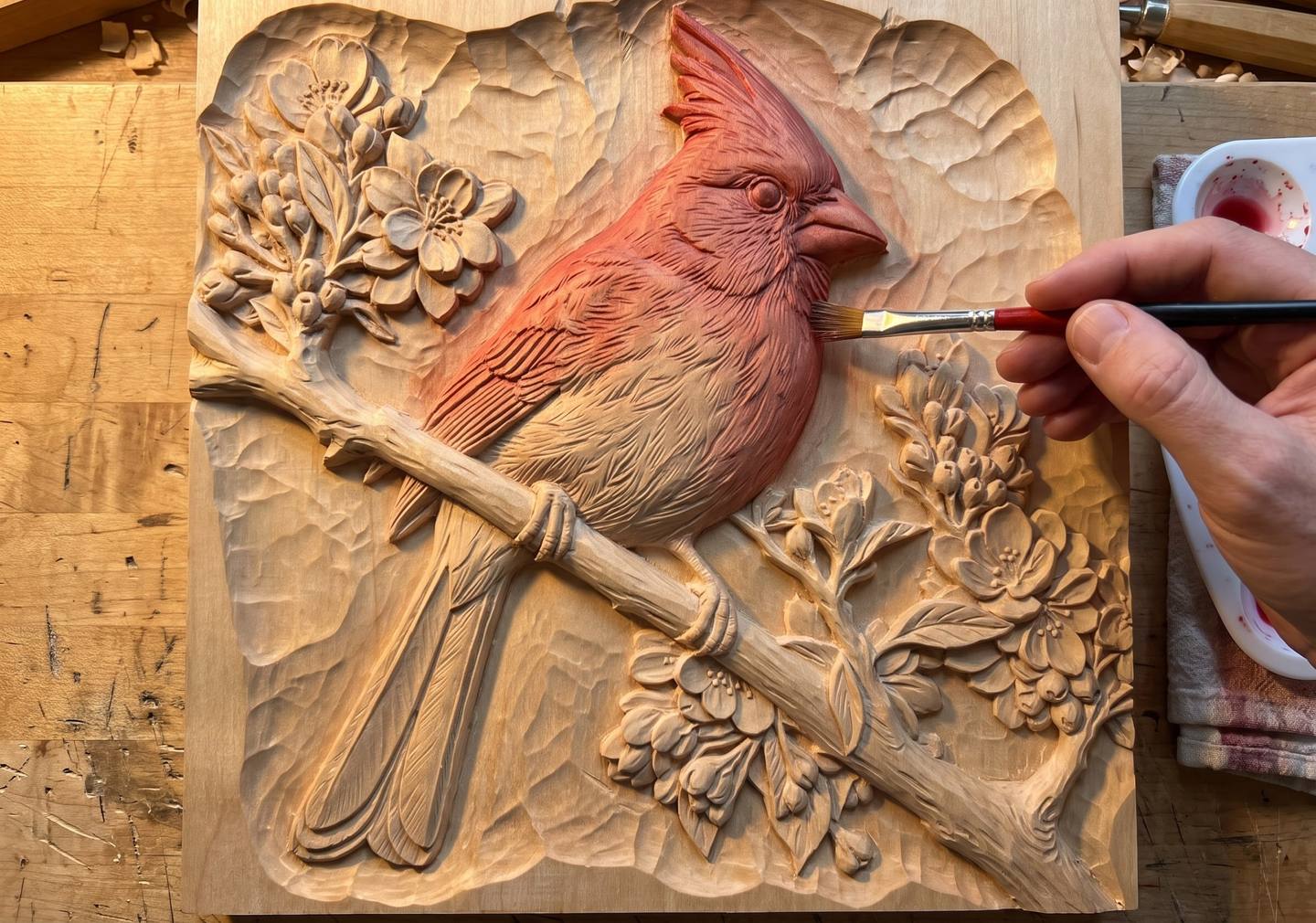
Start with the largest area of the dominant colour, and start light. On the cardinal that is the bird itself.
- Load the size 10 round, then touch it to the rag so it is wet but not dripping. A brush that drips will run into the recesses and pool.
- Lay the wash on in the direction of the form: along the feathers on a bird, along the petal on a flower, along the stem on a branch. The strokes will be invisible, but the direction leaves a faint texture that the eye reads as growth.
- Work from the highest, most forward part of the form toward its edges, and stop a hair short of the carved edge. The wash spreads that last hair on its own.
- If it looks too pale, it is probably right. Let it dry, five minutes, and put on a second coat. Two thin coats always beat one strong one, because the second can be kept away from anywhere the first already looks good.
- If a patch goes on too strong, lift it immediately with a damp bud or the corner of a damp rag. On sealed wood you have about a minute.
Do not colour anything else yet. Let the bird dry fully before the next colour goes on beside it, so the edges cannot bleed into each other.
Step 5: Building the other colours
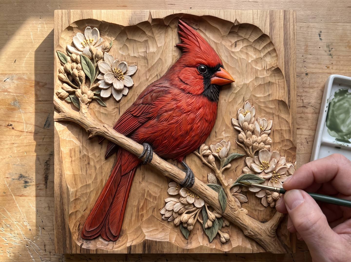
The order matters a little. Go from the colour that would be hardest to correct to the one that is easiest: dominant colour, then darks, then mid-tones, then whites and lights last. On the cardinal: red, then the umber branch, then the sage leaves and brick buds, then the blossoms. A white wash is the easiest to cover if it strays, and the one most spoilt by anything straying into it.
Change brushes as the forms get smaller. Leaves want the size 6 round; the branch wants the flat, laid along its length. Between colours, rinse the brush properly and dry it on the rag; a brush with green still in the ferrule will turn the next white grey.
Leave the ground alone. Every bit of bare carved wood you can see around the bird at this stage is what will make the finished piece look like wood. It is the most valuable thing on the panel and you are protecting it.
Step 6: Shading, so the form comes forward
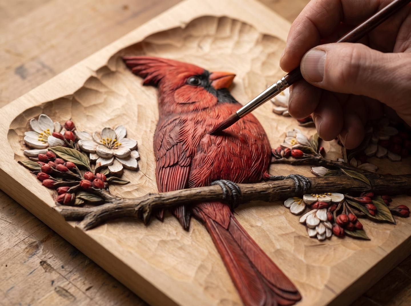
This is the step that separates a coloured carving from a tinted one. A single flat wash, however good the colour, reads as flat. The carving already has real depth; shading agrees with it and doubles it.
Mix a shading wash from the same base colour: the cardinal red with more Burnt Sienna and a touch of Raw Umber, so it is darker and cooler. Keep it just as thin. Then, with the size 6 round, lay it only where the carving is already in shadow: under the wing, between rows of feathers, under the chin, at the base of the crest, where the tail meets the body. On a leaf, along the centre vein and where the leaf disappears under a petal. On a rose, into the heart of the flower and the underside of each petal.
The tops of every form stay the lighter first wash. Do not shade the highlights; light does that for you.
When the shading is dry, and only if a form still looks a little dull, dry-brush its highest ridges. Put a little of the first wash, undiluted this time, on the stubby flat; wipe almost all of it off on the rag until the brush barely marks paper; then drag it very lightly across the tops of the feathers. It catches the ridges and misses the hollows. A little goes a long way and too much undoes the whole transparent look, so stop early.
Step 7: The small touches
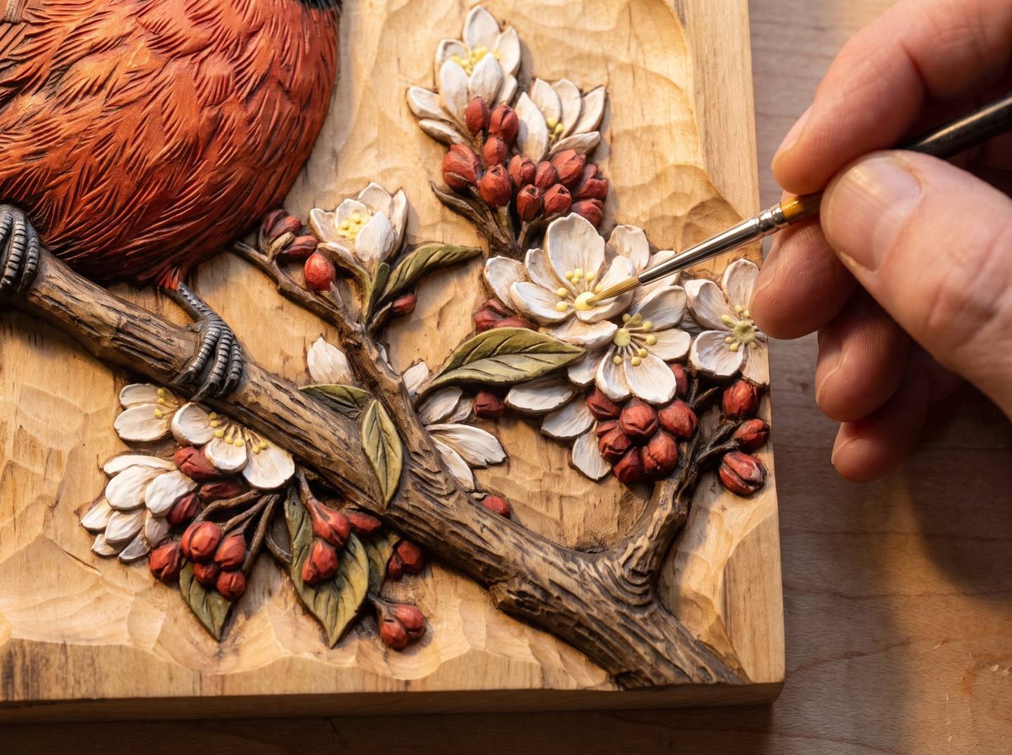
Eyes, beaks, stamens, the pip on a berry. These are the only places where colour goes on nearly full strength, because they are tiny and they are what the eye locks onto. The cardinal's black mask is Raw Umber with a touch of black, thinned only a little; the beak is Cadmium Orange with a touch of Burnt Sienna; the eye is that same dark with one pinpoint of white left bare. The blossom centres are Yellow Ochre with a little Cadmium Yellow, placed with the tip of the size 2 as a single touch each.
Resist the urge to outline anything. Outlining is how painted carvings end up looking like colouring books. The carving already has edges; the light will find them.
Step 8: Keeping the ground clean
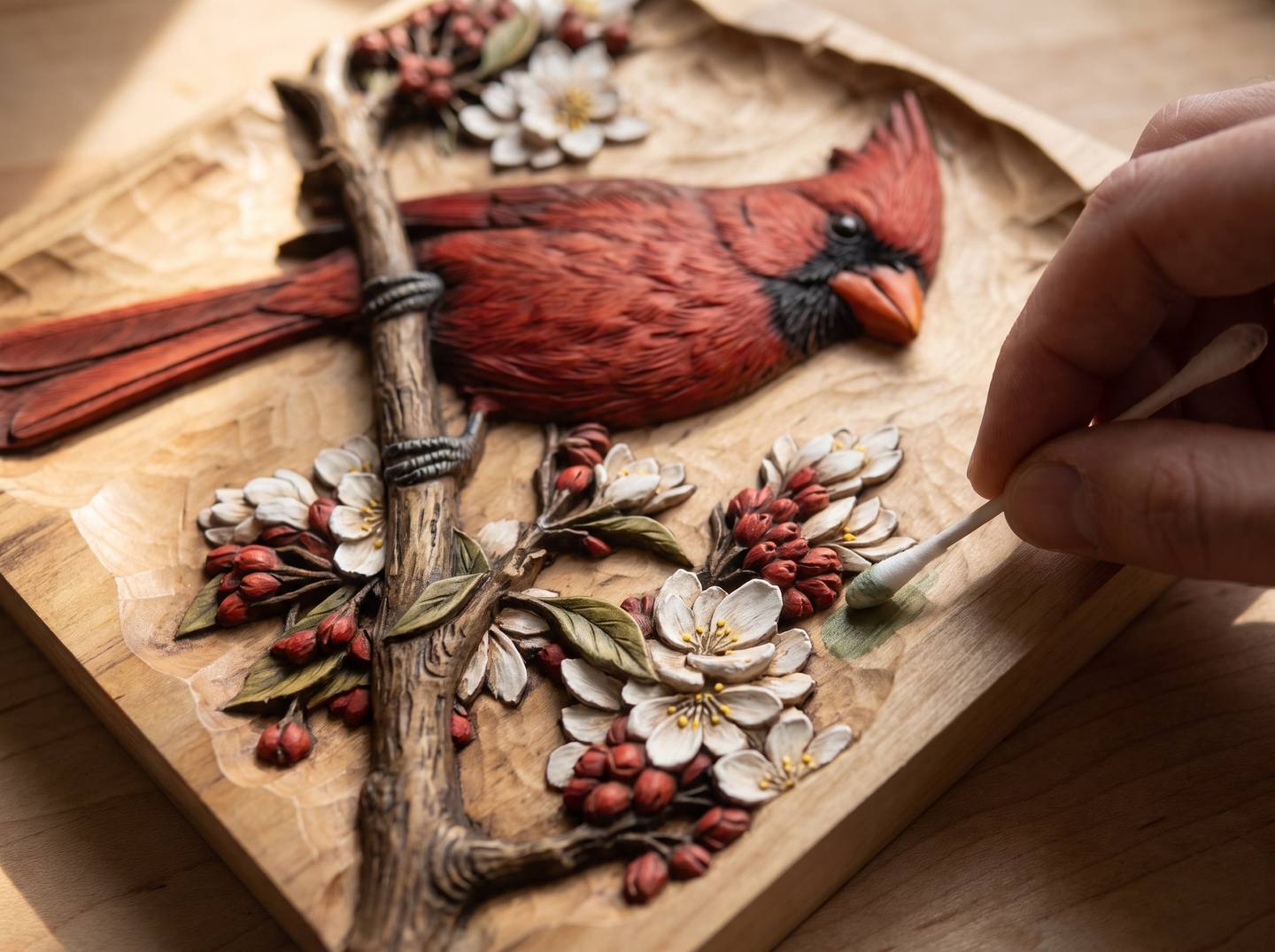
Some wash will stray onto the ground. On sealed wood, it comes off:
- While wet: a damp cotton bud, rolled rather than rubbed, lifts it in one pass. Use a fresh bud each time or you will put it back.
- Once dry: a bud dampened with a little denatured alcohol will still lift acrylic wash from shellac for a day or two. Go gently; alcohol also softens the shellac.
- On a flat ground that has fully cured: a light pass with 320 paper on a hard flat block takes the tint off the top of the texture and leaves the recesses. It is a last resort because it also removes the sealer, so re-seal that patch before the glaze.
Check the ground under a raking light before you glaze, because the glaze will hide a smear for about a week and then it will start to show.
Step 9: The glaze that ties it together
Let the colour cure for a day. Then do the step that turns all of the above into a finished object.
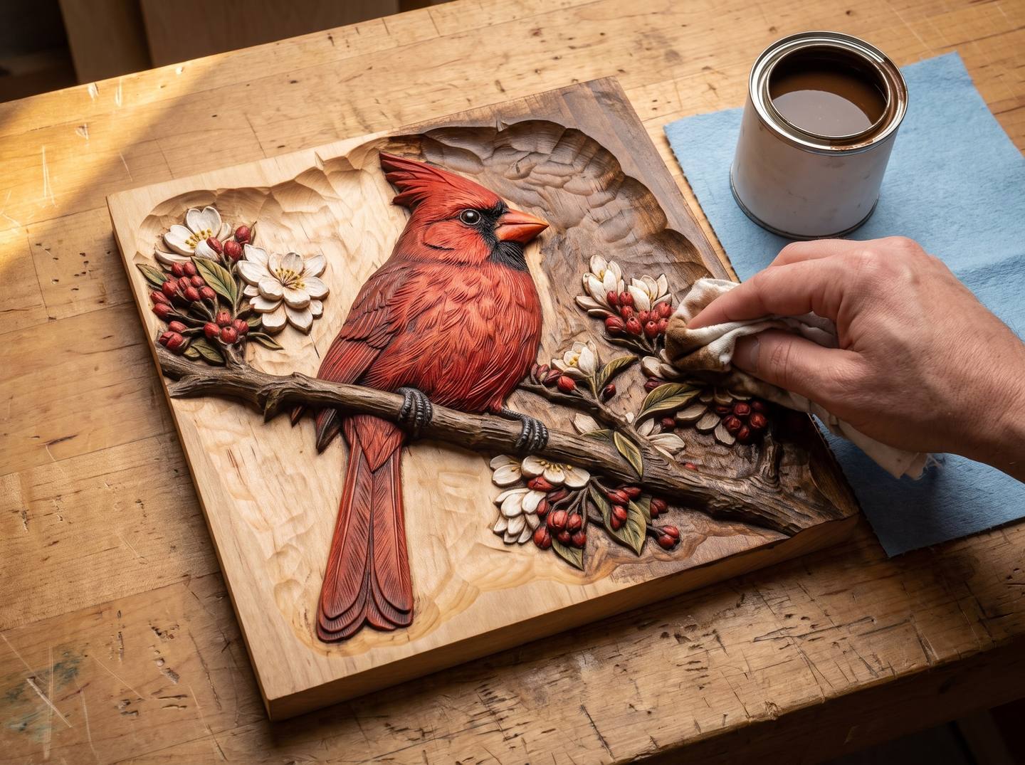
This is the same antiquing step the finishing guide teaches, and on a coloured carving it does more work than anywhere else. A brown glaze over the whole panel, wiped back off the high points, leaves the recesses dark so the depth reads; it takes the "fresh paint" edge off every colour so red, green and white all agree with the wood; and it leaves a trace of brown in the tooling texture inside each coloured area, which is the single thing that makes tinted wood look like tinted wood rather than paint.
- Glaze the test tile first. Watch what it does to the white and the pink. If the glaze swallows them, thin it with a little mineral spirits before it goes near the panel.
- Brush a thin, even coat of Van Dyke Brown glaze or a walnut gel stain over everything, colour and ground alike, and work it into the recesses with a stiff brush.
- Wait two to five minutes, less in a warm shop.
- Wipe back with a folded cotton rag, or burlap, across the high points only, working with the forms. The tops of the feathers, petals and leaves come back to clean colour; the hollows keep the brown.
- Too dark on a colour? A rag with a little mineral spirits lifts it. Not dark enough in the ground? Let it cure and glaze the ground again.
- Cure for at least twenty-four hours before the topcoat, longer if the glaze is oil-based and the topcoat is water-based.
A note on the direction of wiping: on a coloured carving, wipe each area along its own form, feathers along the feather, petals from the centre out. Wiping across a form drags brown over the highlight you spent the shading step protecting.
Step 10: A matte topcoat, never gloss
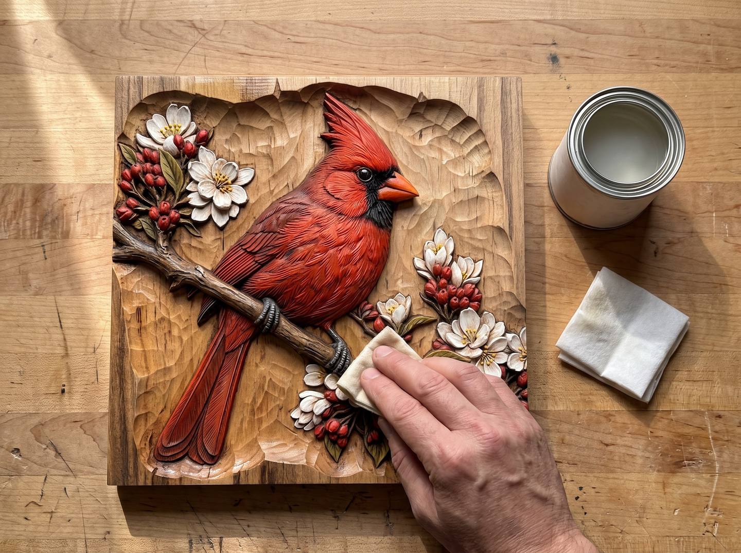
Gloss on a coloured carving destroys the effect in one coat: every shadow gets a highlight in it and the whole thing reads as plastic. The rule is matte or satin, thin, and more than one coat.
| Topcoat | Examples | Notes for coloured work |
|---|---|---|
| Water-based polyurethane, flat or satin | General Finishes High Performance Flat, Minwax Polycrylic Matte | The default over acrylic washes. Non-yellowing, so whites stay white. Wipe it on with a pad or spray; a loaded brush pools. |
| Aerosol lacquer, satin | Deft Satin, Watco Satin, Mohawk | Nothing touches the surface, so it cannot lift a wash. Three light mist coats from 25 cm. Ventilate. |
| Aerosol matte acrylic | Krylon UV-Resistant Matte, Golden Archival Varnish Matte | Artists' varnishes; the flattest finish available and UV protection for the colours. |
| Wax | Renaissance Wax, clear Briwax | Only clear wax over colour; a dark wax will muddy the pinks and whites. Optional, over a cured topcoat, buffed with a shoe brush. |
| Oil finishes | Danish oil, tung oil | Avoid over acrylic wash. They amber the whites and can sit on top of the acrylic rather than in the wood. |
| Brushed polyurethane, gloss anything | Most hardware store cans | Avoid. Pools in the recesses, glosses the shadows, flattens the carving. |
Two coats, lightly scuffed between with a grey pad, is enough for wall art. If the piece is a tray or will be handled, three. Let the first coat go on as a mist or a very light wipe; it is the one that can disturb a wash, and once it is down the rest cannot.
Optional: a trace of metal
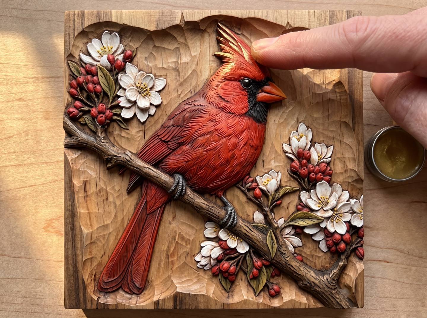
After the topcoat has cured, a fingertip of Rub 'n Buff in Antique Gold or Grecian Gold on the very tips of a few forms, the ridge of a beak, the rim of a ring, the edge of a petal, catches the light and gives the piece a finish that looks expensive. Gilders Paste does the same with a longer working time. The rule is the same as for dry brushing: put it on the highest ridges only, use a tenth of what you think you need, and stop while it still looks like too little. On the wedding rings panel, the rings themselves in antique gold with the roses in dusty rose is the version everyone asks about.
Other routes: dyes, coloured gel stains, milk paint, and printed reliefs
Dyes, for large areas
A water-based dye such as TransTint or Keda goes on bare wood, before sealing, and colours the wood itself with no build at all. It cannot be kept to a carved edge, so it is the wrong tool for a subject on a plain ground, and the right tool for colouring the whole ground: a blue sky behind a mountain scene, a dark green behind a Celtic knot. Dye the whole panel, seal, then wash the subject over the top with acrylic. Dyes are also the answer on a species like cherry where you want to shift the whole board's colour before starting.
Coloured gel stains
Unicorn SPiT and coloured glazes such as General Finishes Glaze Effects behave like a heavy wash: they sit on sealed wood, wipe back, and come in bright colours. They give a bolder, more saturated look than an acrylic wash, and the grain shows less. Popular on signs and on pieces that will be viewed from across a room. Treat them exactly as above; seal first, thin them, and glaze at the end.
The opaque look
For folk art, nursery pieces and signs, opaque colour is the right choice, and the best media for it on a carving are milk paint (The Real Milk Paint Co., Old Fashioned Milk Paint, General Finishes Milk Paint) and chalk paint (Annie Sloan, Rust-Oleum Chalked). Both dry dead flat, sand back beautifully on the edges for a worn look, and take a dark wax or glaze the same way a wash does. Paint the ground a deep colour, paint the subject, distress the high points back to wood with 220 on a block, then glaze and wax. For anything outdoors, exterior acrylic in the recesses and a spar varnish over it, as the finishing guide describes.
3D printed reliefs
If you print our files rather than carve them, the whole method changes, because there is no wood to show through and no grain to protect: it becomes filler primer, a base coat, a dark wash into the recesses, and dry-brushed highlights, which is the opposite order from everything above. That schedule is in the 3D printing guide. The colour recipes in the palette chart still apply; the cardinal red is the same red whether it goes on basswood or on PLA.
Troubleshooting
| What you are seeing | Why | Fix |
|---|---|---|
| Colour has bled along the grain past the edge | Wash went onto bare or under-sealed wood | Sand the bled area back on a block, re-seal, re-wash. Seal properly next time. |
| Colour looks chalky or opaque, grain gone | Wash too strong, or craft paint with a lot of filler | Lift it with alcohol if fresh; otherwise sand back to wood on the tops and start again thinner. Thin to skimmed milk. |
| Wash beads up and will not lay flat | Sealer too glossy, or two coats of it | Scuff with a grey pad. Add a drop of flow improver to the wash. |
| Streaks in a large area | Wash drying before the stroke was finished | Work smaller areas wet-in-wet, or dampen the area with clean water first and lay the wash into it. |
| Green looks like plastic | Green straight from the tube | Add Raw Umber until it stops. Sage is nearer the truth than any "leaf green". |
| Pink turned orange after the glaze | Brown glaze over a warm pink | Predictable on the test tile. Use a cooler pink (more Quinacridone, less Sienna) or thin the glaze. |
| Whites went grey after the glaze | Glaze too strong, or wiped back too late | Lift with mineral spirits on a bud. Next time wipe the whites first. |
| Wash lifted or smeared under the topcoat | A brushed water-based coat over acrylic that had not cured, or brushed too hard | Let colour cure a day. Mist the first coat from a can, or wipe it on lightly with a pad. |
| Whole piece looks like a craft project | No glaze, or colours too pure | Glaze it. If it is already topcoated, a very thin glaze over the topcoat still helps, then one more clear coat. |
| Shiny spots in the recesses | Topcoat pooled | Dull with a grey pad or a brass brush; clear puddles with a dry brush within ten minutes next time. |
Designs that were made for colour
The carving in every photograph above is the cardinal on a blossom branch, chosen because it has everything the method needs: one strong colour, a white, a green, a natural branch, and a plain ground to keep bare. It is a good first coloured piece.
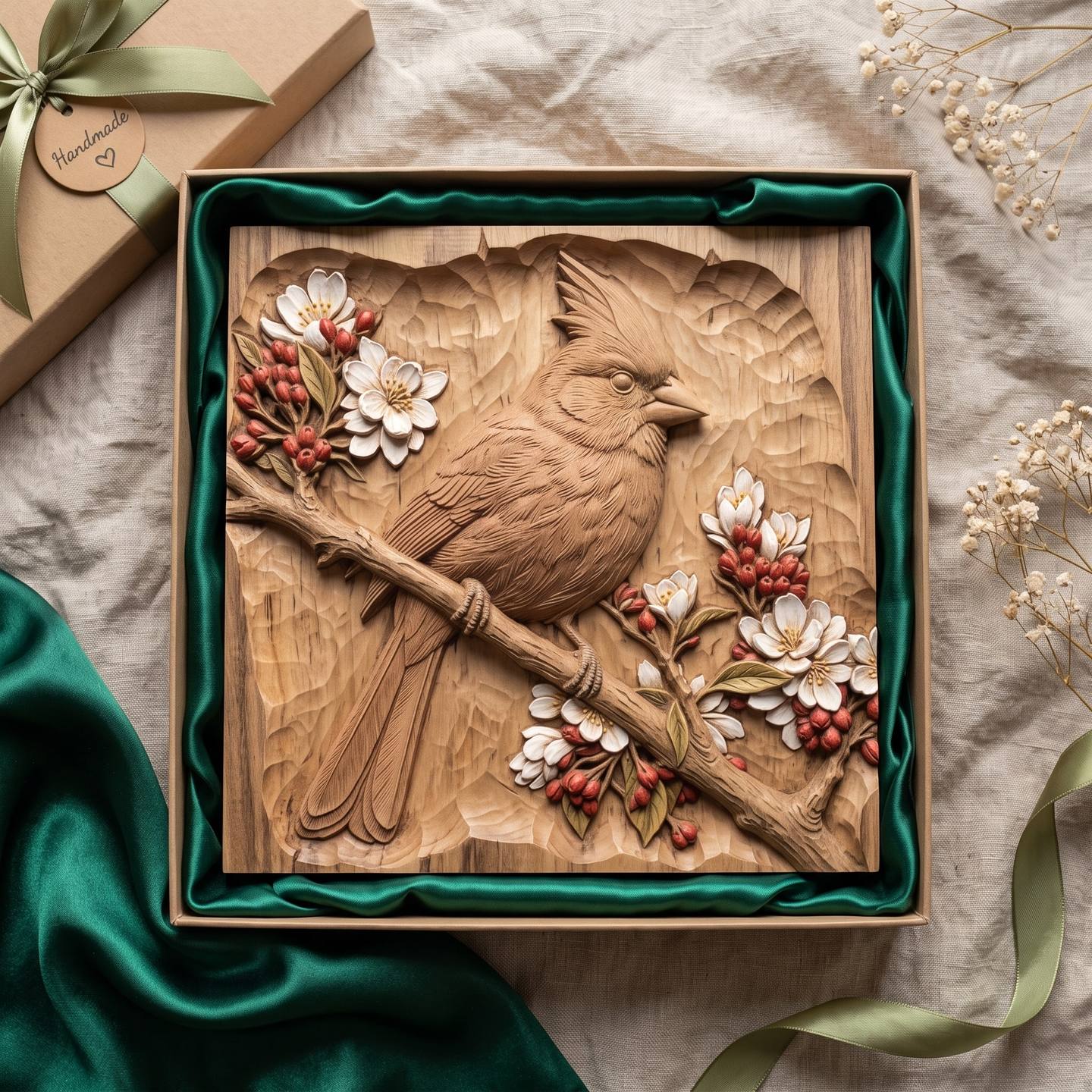
Download the cardinal on a blossom branch · $6.39
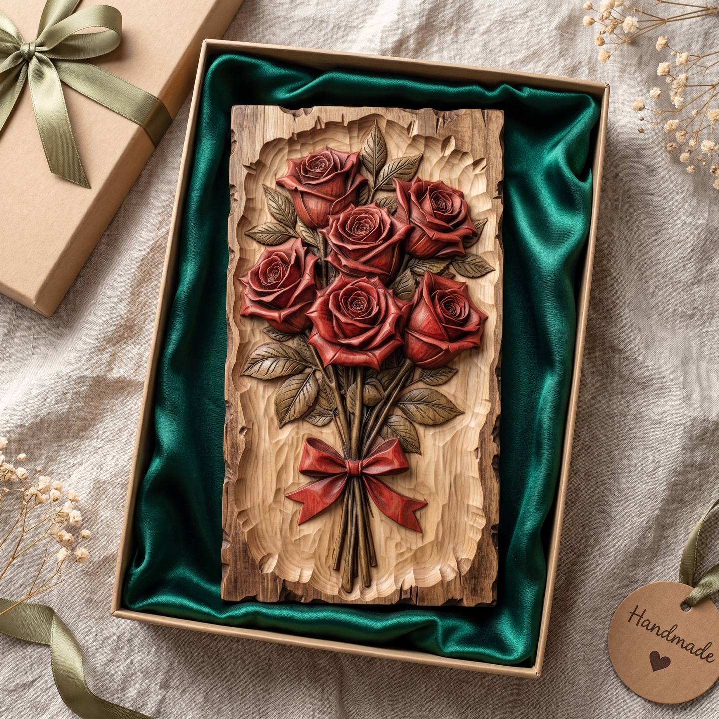
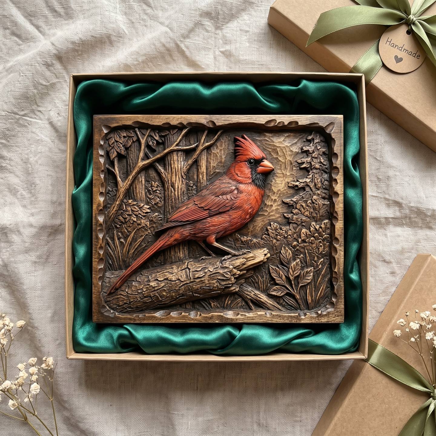
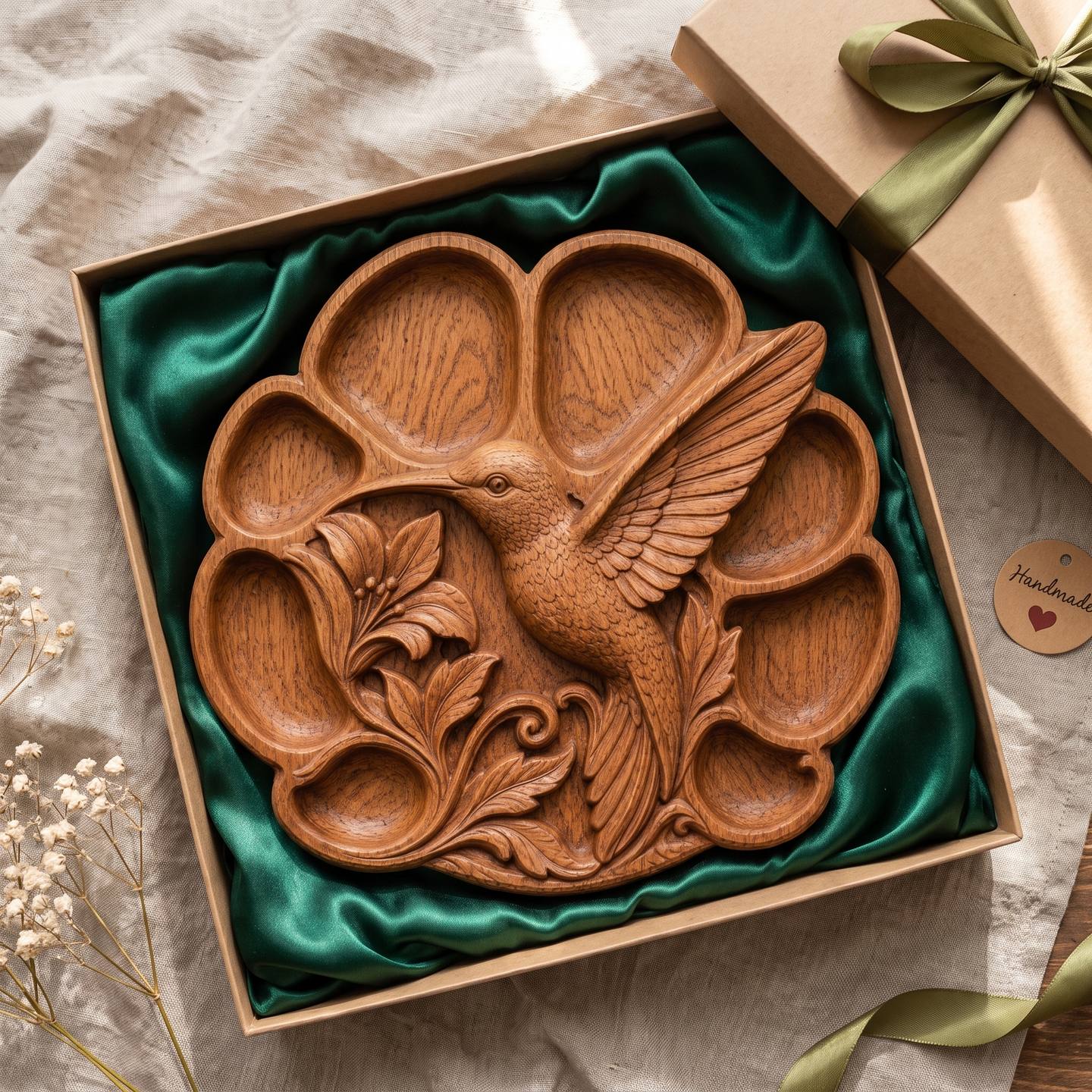
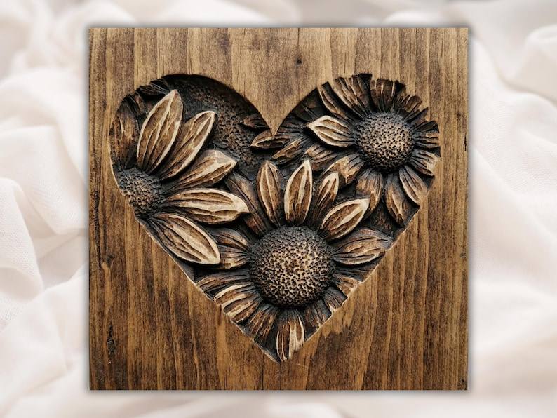
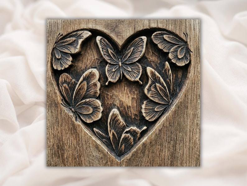
These take the same method just as well. Each has a bounded subject with a natural palette on a plain carved ground.
Common questions
Do I paint a relief carving before or after sealing?
After. Seal the bare wood with a thin coat of dewaxed shellac or sanding sealer, scuff it, then colour. On bare wood the wash bleeds along the grain and cannot be lifted; on sealed wood it stays where you put it and wipes back for a minute.
What paint do you use on CNC carvings?
Artists' acrylics thinned with water to a translucent wash, roughly one part paint to four or five parts water. Golden Fluid and Liquitex Soft Body are the best behaved; craft acrylics work with a little less water and a second coat.
How do I keep the wood grain visible when painting a carving?
Thin the colour until the palette shows through it, put on two thin coats rather than one strong one, keep the background bare, and glaze the whole piece with a brown glaze at the end. The glaze leaves a trace of brown in the texture of the coloured areas, which is what reads as wood.
Can I use stain instead of paint for colour?
For a whole area, yes: a water-based dye on bare wood colours the ground or the whole board evenly. For a subject on a plain ground, no, because stain and dye run past every carved edge. Use a wash for the subject and, if you want, a dye for the ground.
Why does my painted carving look like a craft project?
Nearly always two things: the colours are straight from the tube, and there is no glaze. Add an earth pigment to every mix, and antique the finished piece with a brown glaze wiped back off the high points.
What clear coat goes over painted wood carvings?
A flat or satin water-based polyurethane wiped on with a pad, or a satin aerosol lacquer. Never gloss, never a loaded brush. Let the colour cure a day first and make the first coat a light one.
Should I colour a portrait or a face?
Usually not. A face in natural wood with dark recesses reads as a sculpture; a face in slightly wrong colour reads as a doll. If you must, one very thin wash of Raw Sienna and white, and nothing on the lips or eyes.
Colour on a carving is not a separate craft from finishing; it is finishing with one more step in the middle. Seal, wash thin, shade where the carving is already dark, keep the ground bare, glaze, matte topcoat. The cardinal in these pictures took an afternoon of actual work and two days of waiting for things to cure, and every one of those steps is one you can undo if it goes wrong, right up to the glaze.
If you want a piece to try it on, the full catalogue is here, and the designs above were all chosen for how well they take colour. The five free STL files include one that does too.
Questions about a colour that is not behaving, or a wood that is? Send them over. This guide exists because somebody did.
Jolly, DigitalChiselCo